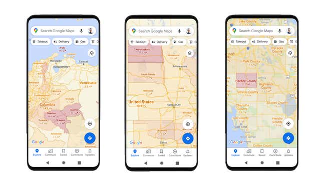
While contact tracing flails in the U.S. thanks in part to government dysfunction, Google’s deploying a feature to at least help us avoid covid-19 hotspots. Sometime this week, Android and iOS users will be able to toggle on color-coded overlays in Google Maps, representing the concentration of positive cases on the country, state, city, and county level. You’ll be able to turn this feature on by clicking the “layers” icon (the one that looks like two small diamonds, stacked) and navigating to “COVID-19 Info.”
The numbers on each color-coded segment represent a seven-day average of new diagnoses per 100,000 people, with arrows indicating upward or downward trends. Google says it pulls data “where available” from Johns Hopkins, the New York Times, and Wikipedia (which itself pulls data from Johns Hopkins). News outlets have heavily relied on Johns Hopkins’s granular “near real time” global tracker with data gathered from a variety of governmental and non-governmental sources, which are listed on Github.
Google already has some covid-19 tools in Maps, like wait time trackers for testing centers based on users’ location data, alerts for covid-19-related transit restrictions and checkpoints, and previously-implemented crowd alerts.
Is it good to know where there are concentrations of new covid cases? Sure. Should you be traveling right now? Probably not. Our government fucked us, so get back inside. These feeds ain’t gonna doomscroll themselves.