

- Best for integrated data infrastructure: Google Looker
- Best for self-service BI: Zoho Analytics
- Best for data visualization: Tableau
- Best for associative analytics: Qlik
- Best for Microsoft integration: Power BI
- Best for large-scale data environments: Sisense
- Best for open-source big data processing: Apache Spark
- Best for real-time data collaboration: Domo
Big data analytics tools have become indispensable, as they offer the insights necessary for organizations to make informed decisions, understand market trends and drive innovation. These platforms enable companies to detect patterns, forecast trends and optimize operations, which helps them get a significant return on investment.
As data continues to grow in volume and complexity, adopting such analytics software is key for maintaining a competitive edge in any industry. Here are eight of the best big data analytics tools.
Jump to:
- Top big data analytics tools comparison table
- How do I choose the best big data analytics software for my business?
- Review methodology
Top big data analytics tools comparison table
Although they deliver big data analytics, each of these eight big data analytics platforms have something unique to offer. To briefly highlight how they differ, here’s how they compare across the core features of data analytics tools and their pricing.
| Software | Real-time analytics | AI and machine learning | Mobile access | Embedded analytics | Open source | Starting price |
|---|---|---|---|---|---|---|
| Looker Studio | Yes | Yes | Yes | Yes | No | Contact for quote |
| Zoho Analytics | Yes | Yes | Yes | Yes | No | $22 per month |
| Tableau | Yes | Yes | Yes | Yes | No | $15 per user per month |
| Qlik | Yes | Yes | Yes | Yes | No | $20 per user per month |
| Power BI | Yes | Yes | Yes | No | No | $10 per user per month |
| Sisense | Yes | Yes | Yes | Yes | No | Contact for quote |
| Apache Spark | Yes | Yes | No | No | Yes | Free (infrastructure costs apply) |
| Domo | Yes | Yes | Yes | Yes | No | $300 per month |
Google Looker: Best for integrated data infrastructure

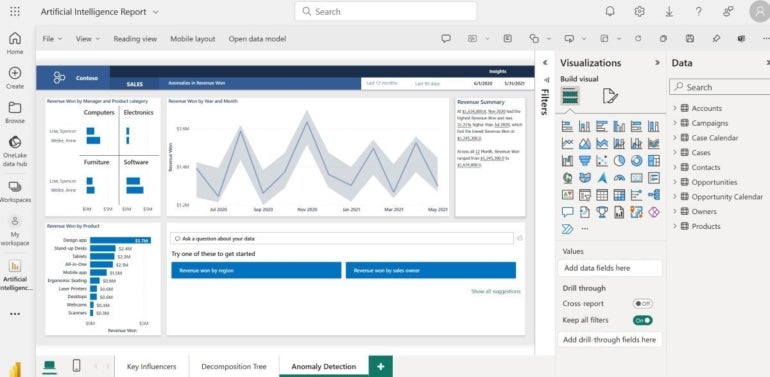
Looker Studio emerges as a cutting-edge platform that revolutionizes how businesses harness the power of their data. As part of the Google Cloud suite, Looker extends beyond traditional data analysis by offering an integrated approach to data infrastructure. It stands out for its robust data modeling language, LookML, which allows for intricate data exploration and the development of powerful data experiences. Looker’s commitment to enabling real-time analytics makes it a top choice for businesses seeking to integrate analytics into their daily workflows seamlessly.
Pricing
Looker’s premium tiers are the Standard, Enterprise and Embed editions, which offer custom pricing that its sales team is happy to discuss.
Features
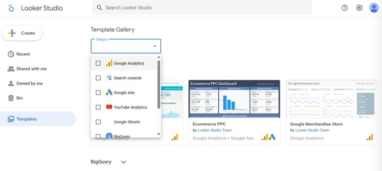
Figure A
- Integrated data platform with BI and big data analytics capabilities.
- Real-time data exploration and reporting.
- Customizable data modeling language (LookML).
- A template gallery (Figure A) and advanced data visualization tools.
Pros
- Seamless integration with Google Cloud Platform services.
- Highly scalable with strong security features.
- Collaborative environment with shared dashboards and reports.
Cons
- Steeper learning curve due to LookML.
- Pricing can seem complex.
Why we picked Google Looker
Google Looker’s integration with Google’s advanced AI and machine learning tools, coupled with its powerful data modeling capabilities, positions it as a leader for teams that demand cutting-edge data infrastructure integrated with their analytics.
SEE: Explore this Looker Studio beginner guide.
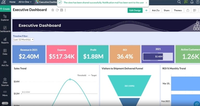
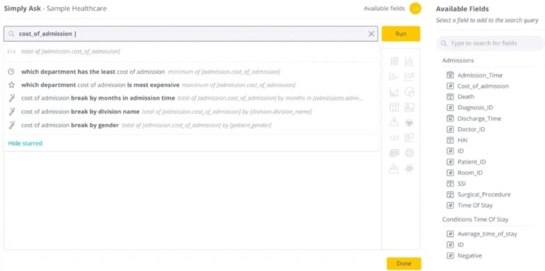
Zoho Analytics is a self-service BI and data analytics software that democratizes data analysis, making it accessible to all levels of business users. With its AI-powered assistant and an extensive array of data connectors, Zoho Analytics simplifies the complex process of data gathering and interpretation. It’s designed to empower teams with data without investing heavily in training or technical support, making it a standout choice for user-friendly analytics. Zoho Analytics has 5 paid plans, Basic at $22 per month, Standard at $45 per month, Premium at $112 per month and Enterprise at $445 per month, all billed annually. The fifth plan is Custom, which requires you to share your requirements with Zoho and get a quote. Figure B We picked Zoho Analytics for its integration with the Zoho ecosystem, alongside its user-centric design and intelligent features. Plus, its affordability and ease of use do not come at the expense of powerful analytical capabilities. SEE: Discover how Zoho Analytics compares to these other top data science tools.
Zoho Analytics: Best for self-service BI
![]()
Pricing
Features
Pros
Cons
Why we picked Zoho Analytics
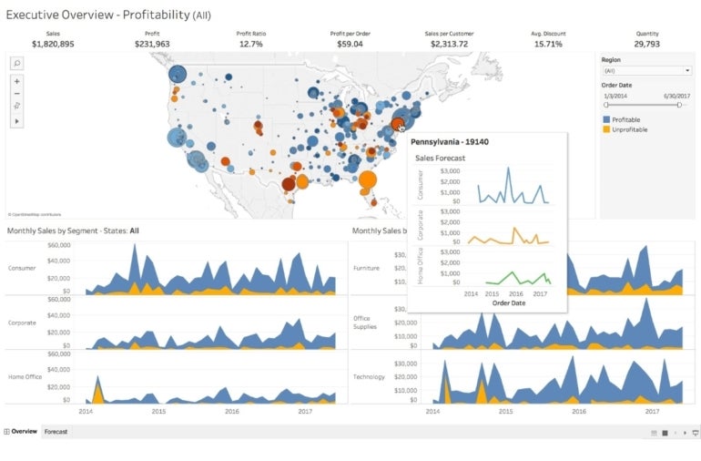
Tableau has set the standard for data visualization with its intuitive interface and powerful analytical capabilities. It’s a tool that transforms the way businesses think about data, turning complex datasets into compelling visual stories. Tableau’s ability to connect with almost any data source and its strong mobile capabilities make it a top choice for organizations that value visual data interaction and on-the-go access. Tableau has 3 paid plans, Viewer, Explorer and Creator, which are priced at $15, $42 and $75 per user per month, respectively, when billed annually. Figure C Tableau is our pick for its unparalleled data visualization capabilities that serve a wide range of business needs. From individual analysts to enterprise-wide deployments, Tableau offers a flexible and user-friendly platform that makes it a leader in transforming data into actionable insights. SEE: For more information, check out our Tableau cheat sheet.
Tableau: Best for data visualization
![]()
Pricing
Features
Pros
Cons
Why we picked Tableau
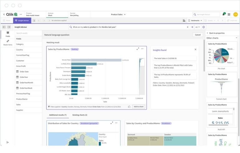
Qlik stands apart in the big data analytics space with its associative analytics engine, which allows users to explore data without the limitations of query-based tools. This unique approach enables a more natural discovery of insights. A business that wants to foster a data-driven culture without constraining its exploration to predefined paths should definitely consider Qlik. Qlik has three plans, Standard, Premium and Enterprise which requires you to contact Qlik for a quote. The Standard and Premium plans cost $20 per user per month and $2700 per month respectively when billed annually. Figure D We picked Qlik for its innovative associative engine that changes the way users interact with data. It’s perfect for teams that require a solution that promotes free-form data exploration and insight generation. SEE: See how Qlik compares to Tableau.
Qlik: Best for associative analytics
![]()
Pricing
Features
Pros
Cons
Why we picked Qlik
Power BI is Microsoft’s flagship analytics service, offering deep integration with the Microsoft ecosystem, including Azure and Office 365. It’s a thorough solution that brings AI-powered analytics and an extensive visualization library to the fingertips of its users. Power BI’s ability to seamlessly mesh with existing Microsoft applications makes it a top choice for businesses heavily invested in the Microsoft suite. Aside from a free plan, it offers a Pro and Premium plan, of which the latter is split into three categories. The Pro plan costs $10 per user per month, while the Premium plan starts at $20 per user per month. Figure E Power BI’s integration with Microsoft products makes it the best choice for teams looking for a BI solution that works cohesively with their existing Microsoft infrastructure. Its affordability and robust feature set make it hard to ignore for a wide range of business analytics needs. SEE: For more information, check out our comprehensive Power BI review.
Power BI: Best for Microsoft integration
![]()
Pricing
Features
Pros
Cons
Why we picked Power BI
Sisense is tailored for performance in large-scale data environments, offering an end-to-end data analytics platform that excels in processing vast datasets. Its in-chip technology and ability to customize dashboards and analytics make Sisense a top choice for enterprises that deal with complex data and require rapid, in-depth insights. Sisense offers custom pricing, meaning you have to contact them for a quote. Figure F Sisense is our choice for its fast data processing and customization capabilities, which are essential for businesses that handle large-scale data operations. It’s particularly suited for any team that needs a powerful, agile BI tool that can keep pace with their data demands. SEE: Learn how Sisense compares to other top business intelligence tools.
Sisense: Best for large-scale data environments
![]()
Pricing
Features
Pros
Cons
Why we picked Sisense
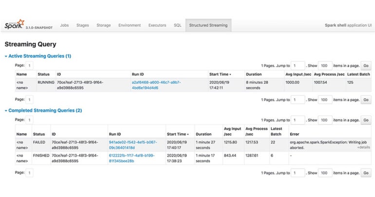
Apache Spark is the leading open-source engine for large-scale data processing, known for its speed and ease of use. It supports a wide array of tasks — from batch processing to real-time analytics and machine learning — making it a versatile choice for businesses that need a robust, scalable data processing platform. Apache Spark is free and open source. Figure G Apache Spark is chosen for its exceptional processing capabilities and open-source nature, which offers businesses a flexible and cost-effective solution for their big data needs. SEE: Compare Apache Spark with Apache Hadoop.
Apache Spark: Best for open-source big data processing
![]()
Pricing
Features
Pros
Cons
Why we picked Apache Spark
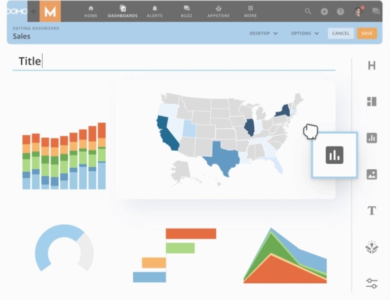
Domo specializes in real-time data collaboration, offering a cloud-based platform that integrates various data sources for a cohesive analytics experience. With its emphasis on collaborative tools and a user-friendly interface, Domo is great for organizations that prioritize agility and want to make data the centerpiece of their decision-making process. In addition to a free plan, Domo has three paid plans, Standard, Enterprise and Business Critical. The Standard plan starts at $300 per month while the remaining plans need prospective clients to talk to Domo sales for a quote. Figure H Domo is our pick for its comprehensive platform that not only excels in data integration and visualization but also in fostering a collaborative data culture within organizations. SEE: Check out why Domo is considered one of the top Power BI competitors.
Domo: Best for real-time data collaboration
![]()
Pricing
Features
Pros
Cons
Why we picked Domo
How do I choose the best big data analytics software for my business?
To determine which big data analytics tool works best for your business, you have to understand your business’s data strategy, its big data needs and from that deduce the features it would require, then search for a tool that proposes to meet the needs of your business.
PREMIUM: Use this guide to compare product features for data analytics software.
Some key considerations to guide your choice include the compatibility of the software with your existing data systems and whether it can handle the scale of data you work with, both now and as your business grows. The ease of use is also critical. A user-friendly interface can widen adoption across your team, while the depth of analytical features should match your needs for data processing and analysis.
Cost is an important factor, but it should be weighed against the potential return on investment the tool can offer through insights and efficiencies. As for security, security features and compliance with regulations are non-negotiable, as they protect your data assets and ensure legal conformity. Finally, the level of vendor support and the presence of an active user community can be invaluable resources for not only troubleshooting but also learning best practices.
For a step-by-step approach to selecting the right tool, check out our video on how to choose the right analytics tool in 5 steps.
Review methodology
To provide this review of the top big data analytics solutions, we examined eight popular tools across their pricing and features while determining their strengths and weaknesses. We studied the features listed on their websites and datasheets to inform our research, and we compared them with the reviews of verified users to understand whether they delivered what they stated. Finally, we tried the products where possible to have a feel for their functionality for ourselves and understand the standout use case of each tool.