
Tableau’s fast factsPricing: Starts at $15per user per month. Key features:
Take advantage of Tableau’s 14-day free trial
|
Tableau stands out in a crowded field of business intelligence tools through its data visualization capabilities and user-friendly interface. Unlike many BI tools, Tableau offers a blend of simplicity and depth, championing its suitability for both novice users and experienced data scientists.
At a starting price of $15 per user per month, Tableau is an affordable solution compared to its main competitors, with features that cater to a broad range of business professionals, including business analysts, marketing specialists and executives, not just data scientists. However, despite its intuitive interface and vast integration options, alternatives like Looker Studio and Alteryx might be worth considering should Tableau not be a good fit.
Jump to:
- Tableau pricing
- Key features of Tableau
- Tableau pros and cons
- Alternatives to Tableau
- Review methodology
Tableau pricing
Tableau has three main pricing tiers, Creator, Explorer and Viewer. Aside from these tiers, Tableau offers a 14-day free trial.
Tableau Creator
Priced at $75 per user per month, billed annually, Tableau Creator offers comprehensive analytics tools, including Tableau Desktop for data visualization and analysis, Tableau Prep Builder for data preparation, and a Creator license on Tableau Cloud for online analytics. It’s a great tier for users who manage the full spectrum of data tasks, from preparation to visualization.
Tableau Explorer
Tableau Explorer, available at $42 per user per month when billed annually, is best for users who need self-service analytics. This plan offers an Explorer license of Tableau Cloud, which empowers users to explore trusted data and answer their questions quickly. Teams and departments that need regular data interaction minus complex data preparation tools should consider this tier.
Tableau Viewer
The Tableau Viewer tier, billed annually at $15 per user per month, is ideal for users who need to view and interact with dashboards and visualizations. This plan is perfect for team members who need access to data insights on a secure and easy-to-use platform without the necessity of creating or editing data visualizations.
Key features of Tableau
Intuitive user interface
Tableau has a simple and pleasant user interface that allows users to work through the platform with ease (Figure A). From its home page, users are presented with multiple options concerning workbooks, projects, users, flows, data sources and more. And to ease some confusion, Tableau has a search bar for finding content types and suggestions.
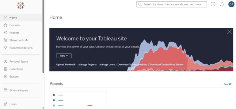
Additionally, the platform displays the most recent projects on the home page for a convenient user experience. All of the elements for creating and managing projects are easily accessible. However, as intuitive as the tool is, the sheer number of elements on screen can easily overwhelm new users, especially those with less data experience.
SEE: Explore our guide on how to use Tableau.
Real-time visual analytics
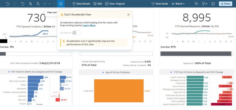
Tableau enables unlimited data exploration with live visual analytics. Users can effortlessly connect to data sources on-premises or in the cloud. They can even interact with the resultant dashboards in real time, with options to edit and customize views with drag-and-drop functionality as well as the ability to accelerate views to mitigate querying and rendering bottlenecks when loading a view (Figure B).
Mobile access
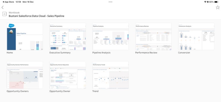
With Tableau Mobile, users can access, analyze and share data from anywhere using mobile devices, providing flexibility for businesses with remote teams or those needing to make data-driven decisions on the go (Figure C). Multiple workbooks are also available in not only desktop but mobile views as well. However, I found the performance of the mobile version to be much more stable on iPadOS than on Android.
Accelerators
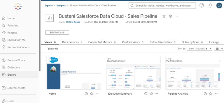
Tableau delivers dashboards for data sources, including Salesforce, Salesforce Data Cloud, ServiceNow ITSM, LinkedIn Sales Navigator, Oracle Eloqua and Marketo. These prebuilt workbooks enable users to sign in to their data sources or use sample data for their projects. Setting up these accelerators is as simple as choosing one from a list of dashboards, naming a workbook, and signing in to a data source or choosing to use sample data (Figure D).
Advanced analytics integration
Tableau supports integration with advanced analytics tools like R, Python and Einstein Discovery. The benefit for users is that they get to visualize and understand complex data sets, especially for teams that carry out deep data analysis.
Tableau pros and cons
| Pros | Cons |
|---|---|
|
|
Alternatives to Tableau
| Software | Tableau | Looker Studio | Alteryx | Domo | Databox |
|---|---|---|---|---|---|
| Analytics | Automated, AI-driven | Embedded analytics and Google Cloud integration | Spatial and predictive analytics | Bi-directional database connectors and ETL tools | KPI tracking and data visualizations |
| Customization | High | High, especially with Google services | High for data workflows | High for data visualization | Customizable branding |
| Real-time dashboards | Yes | Yes | Limited | Yes | Yes |
| Custom visualizations | Yes | Yes | Yes | Yes | Yes |
| Mobile accessibility | Yes | Yes | Yes | Yes | Yes |
| Starting price for paid tiers | $15 per user per month | $30 per user per month | $4,950 per user per year | $300 per month | $47 per month |

Looker Studio
Looker Studio is a BI and analytics platform that excels in its unique modeling language, LookML. This feature allows for highly flexible and powerful data modeling. Looker is particularly strong in embedded analytics, enabling seamless integration of data insights into applications and workflows. Users might consider Looker over Tableau for its advanced customization capabilities and strong integration with Google services.
SEE: For more information, check out our detailed comparison of Looker versus Tableau.

Alteryx
Alteryx offers a data analytics platform that is both code-free and code-friendly, accommodating a wide range of user expertise. It stands out for its automated workflows, which streamline the data preparation and analysis process, and its spatial and predictive analytics capabilities. Teams may choose Alteryx over Tableau for its emphasis on self-service analytics and its ability to handle complex data workflows with minimal coding.
SEE: For more information, check out our detailed comparison of Alteryx versus Tableau.

Domo
Domo is a cloud-based BI tool known for its comprehensive data integration and real-time dashboard creation capabilities. Its user-friendly interface allows for the easy building of data visualizations and interactive dashboards. Domo may trump Tableau when it comes to its strong data integration capabilities, ease of creating visualizations and real-time data processing.
SEE: For more information, check out our detailed comparison of Domo versus Tableau.

Databox
Databox is a business analytics platform known for its intuitiveness and customizable dashboards. It excels in real-time data tracking and key performance indicator visualization, and its collaboration tools, alerts and notifications enhance team communication and responsiveness. Users may prefer Databox to Tableau for its strong focus on KPI tracking, ease of use and extensive customization options, especially for marketing and sales analytics.
SEE: For more information, check out our detailed comparison of Databox versus Tableau.
Review methodology
Through a combination of pricing, features, pros and cons, we reviewed Tableau to understand where it thrives and where there’s room for improvement. We signed up for a 14-day free trial of Tableau Cloud and Tableau Mobile to get a first-hand feel of its vast range of capabilities and to assess its performance through a couple of simple projects. We then compared Tableau to three similar products and delivered alternatives for users who wouldn’t find it to be a great fit.
SEE: For a deeper dive, check out our Tableau cheat sheet.